Clark Health Communications
Clark Health Communications are an independent health and medical communications agency based in London. They work closely with their clients to provide multiple communications solutions to drive change in the industry. They provide support for stakeholder relations, internal communication, digital marketing, meeting facilitation, scientific writing and content development. They approached us with a new website brief, they were looking for a website that would help them better portray their brand message, services, and ultimately convert visitors into clients.
The Brief
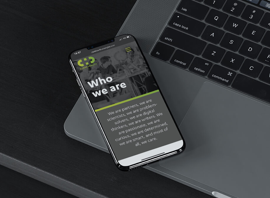
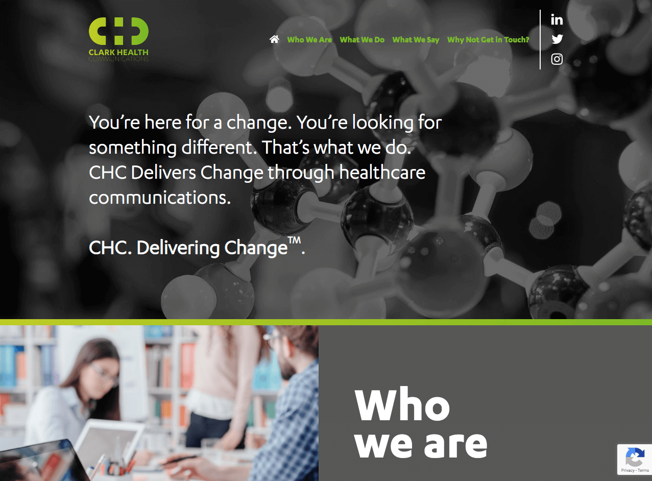
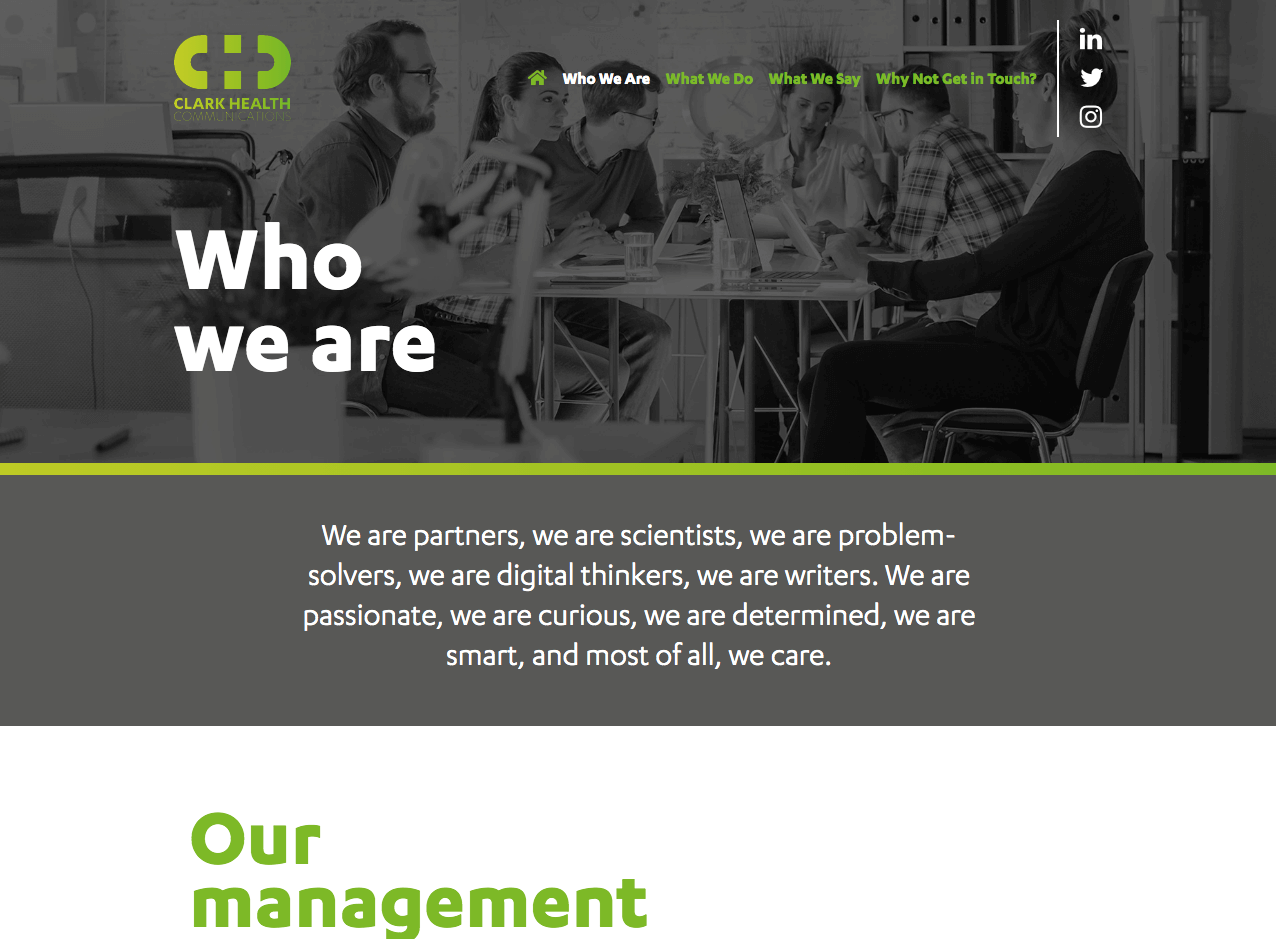
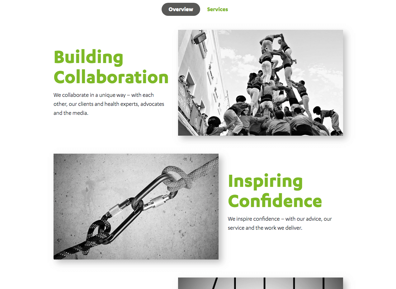
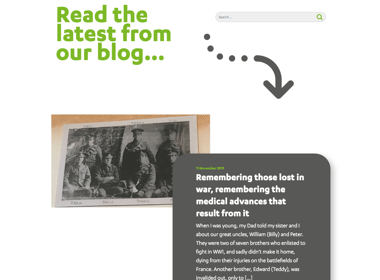
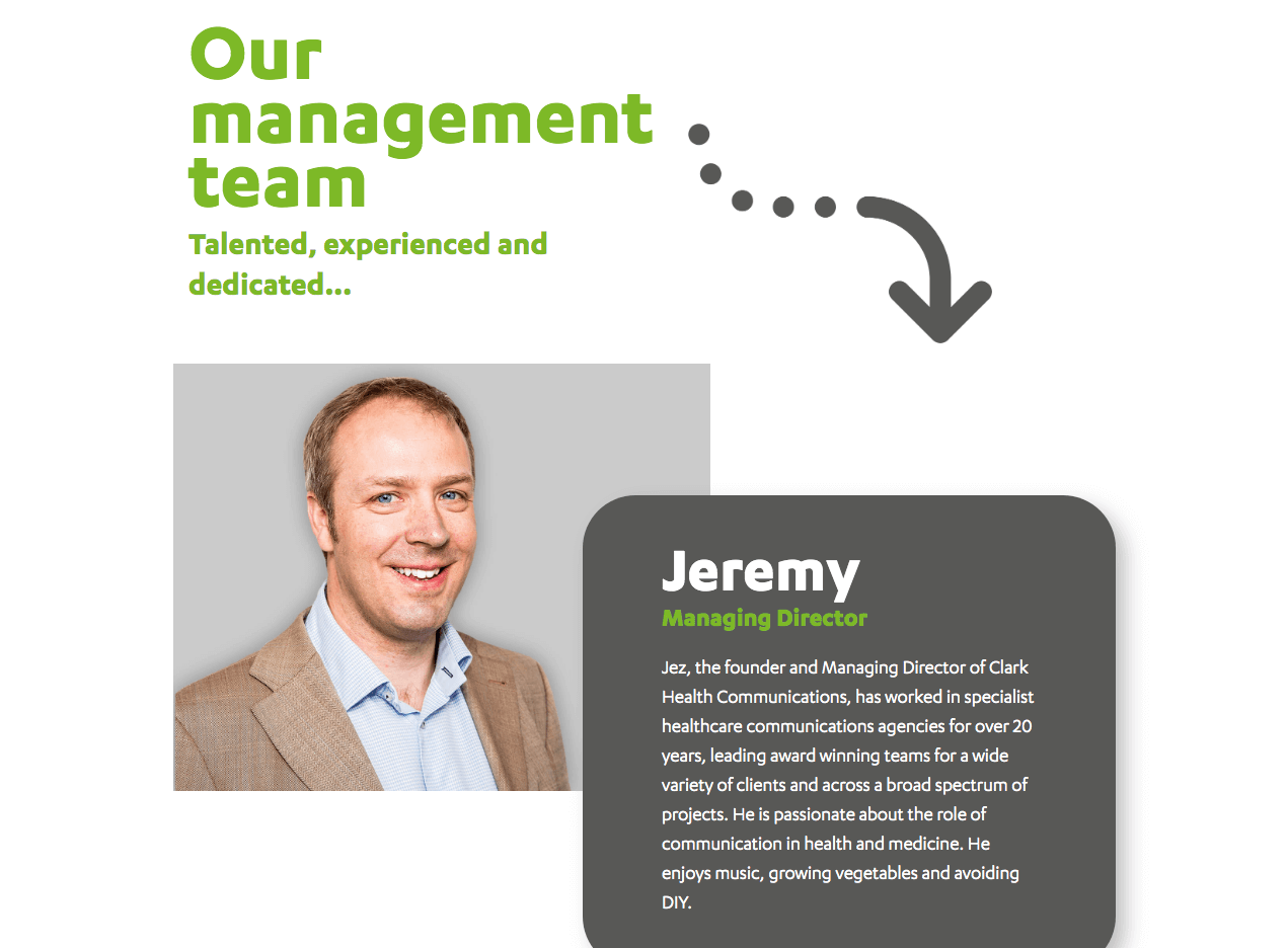
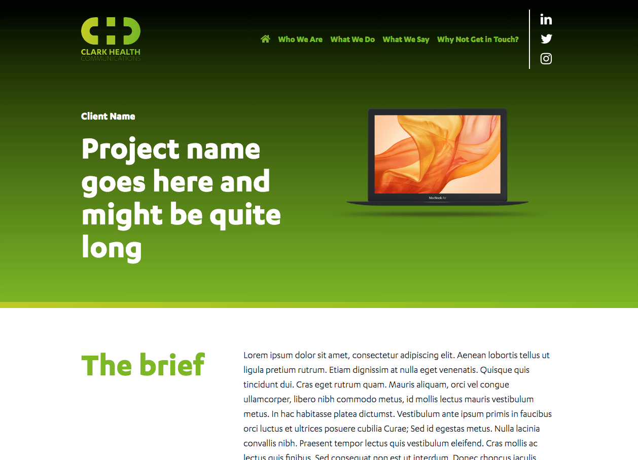
To kick off this project Clark Health sent us some new visuals and brand concepts they had produced earlier in the year. We took these and designed a full set of page designs (see above). They were looking for something modern but also a website that would survive the test of time, they liked websites with animation and movement, and they were clear about the content they needed to display.
The Solution
Using these design assets Clark Health had provided for their website brief we discussed different styles and structures for the site. We were able to combine the photography they liked with their iconography in a way that resulted in a fun yet credible website. We considered animation throughout the design stage as we knew that Clark Health were looking for something that would make their website stand out from the crowd. To understand what we mean by animation, take a look at the finished site here.
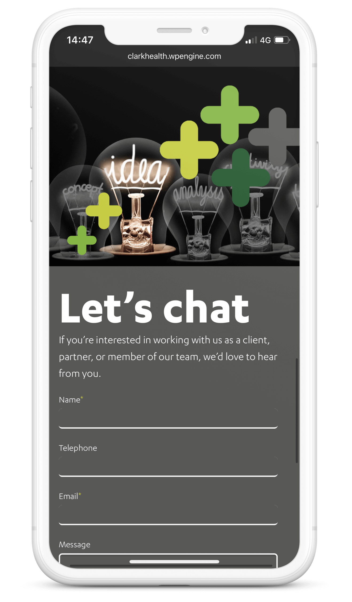
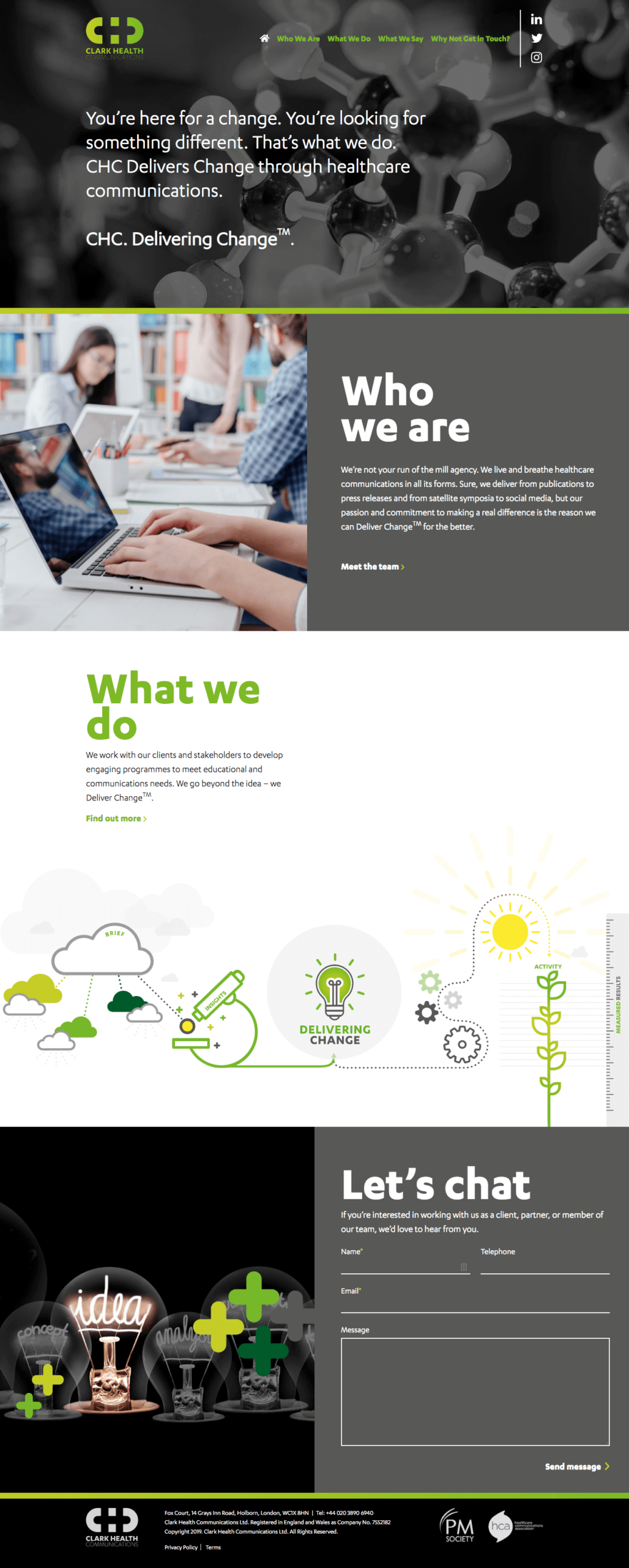
We built the website mobile first ensuring that all modules would work well across all devices. The website was made in modules, this way we were certain the pages were consistent and worked well together. Working on a website in this way we’re able to future-proof the site, enabling the client to add additional sections or pages without jeopardising the design.
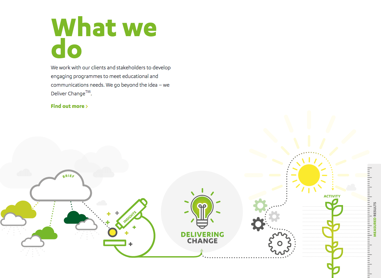
The best part of the project, but probably the most challenging part, was adding the animation and ensuring this was compatible on both mobile and desktop. We concentrated on the homepage and bringing the page alive, especially where icons were used. For example their ‘Delivering Change’ model was something they were keen to portray visually on the website to help explain to clients and perspective clients what it was. By adding animation to this diagram it really emphasises it’s importance.
Project Lead

Fiona Davison
Account Manager
We absolutely loved working on this website and we’re really happy we get to continue to help manage content, provide support services and work on optimising and improving the website conversions.

