Trends might suggest following or copying others but what we really mean is the latest insights from web designers and analysts that can be taken away and used in a creative way to influence popular web design.In 2019 we have seen the digital marketing industry reverting back to simplicity in design, prioritising user experience and focusing on accessibility. It is no surprise to any of us that 2020 will be all about clarity and delivering clear, concise messages to visitors. Content and visuals will still be just as important, richer in fact, but following these design trends will create simple and uncluttered websites.
These are what we think are going to be hot trends for 2020.
If you’re thinking of a website refresh then please get in touch we would love to discuss how a bit of design work could do wonders for your conversion rates!
1. High contrast solid colour blocks
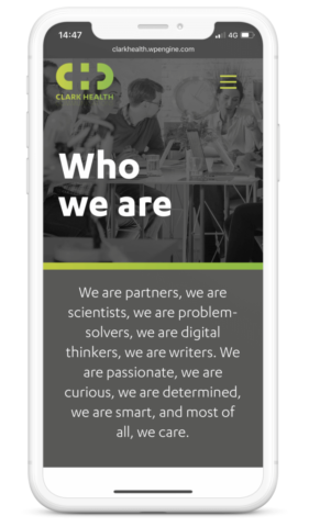
There are many reasons why colour blocking and using contrasting colours is beneficial for your design. One very important reason is accessibility. The contrast helps the user view the page and digest the information. There are many tools a designer can use to test colour contrasts, for example ‘Contrast-Ratio’. However, there’s more than just a practical benefit to this trend; colour blocking with bright contrasting colour is something we’ve seen creep up in the fashion industry and is now flooding the world of design. We’re increasingly see bursts and pops of bright colours throughout websites. The trend works well, it can guide users through a site and be used to break up text, highlight important information, images, and is really effective when used in animation. Often the blocks are of a single colour in geometric shapes, they might contain text or images but mostly they remain simple and easy on the eye.
2. Split screen content
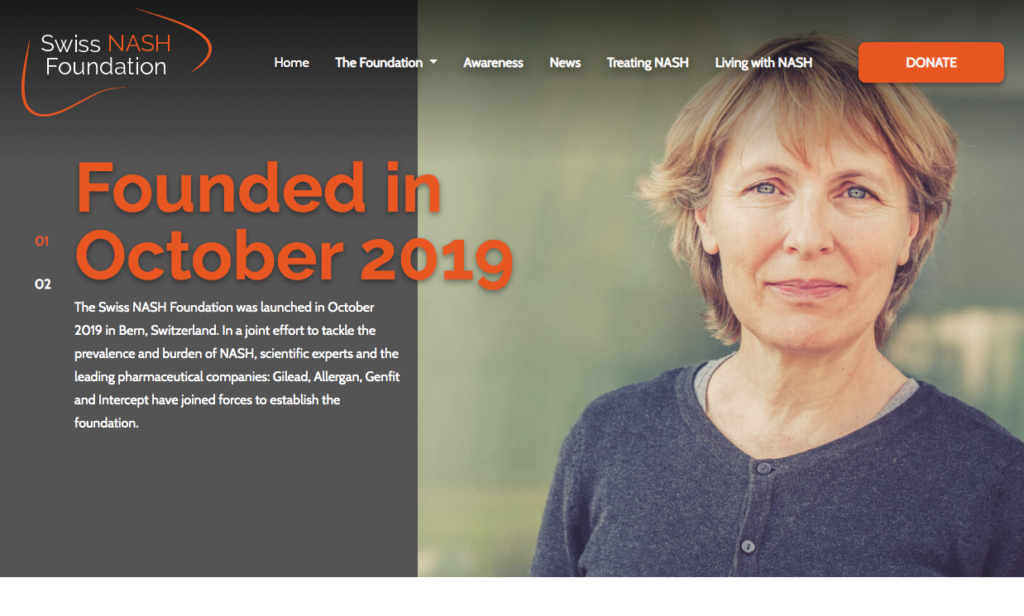
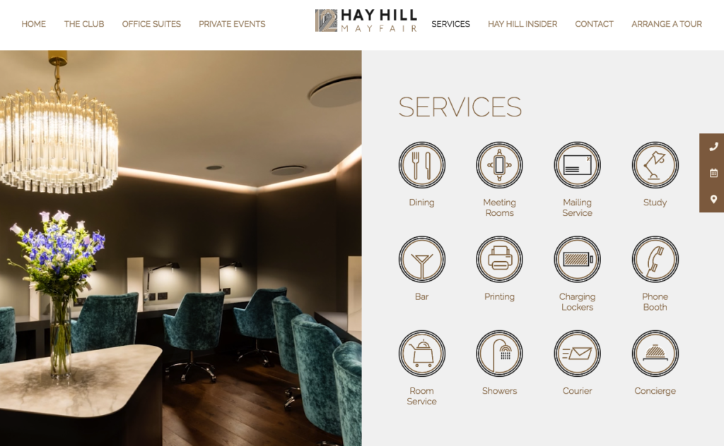
Split screen designs have been growing in popularity. As with all trends, there are practical reasons for this growth; it is great for mobile compatibility and user friendliness. It is great for content that requires the user to make a decision immediately, for example if a company offers a service for an individual user but also other services for an organisation (banking), or clothing for male or clothing for female (retail). It is an easy way to incorporate vertical images and to differentiate a website from the common full-screen hero homepage.
3. Bespoke illustration
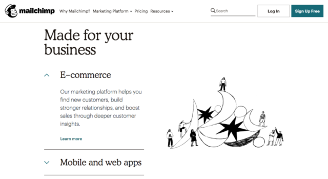
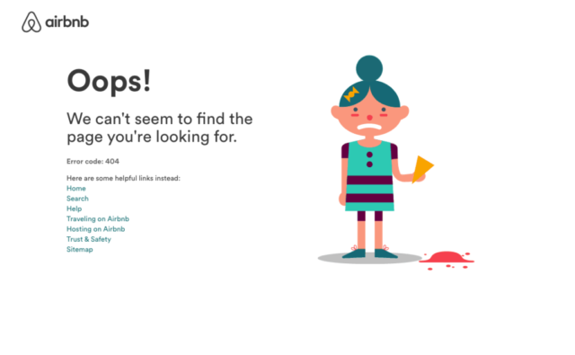
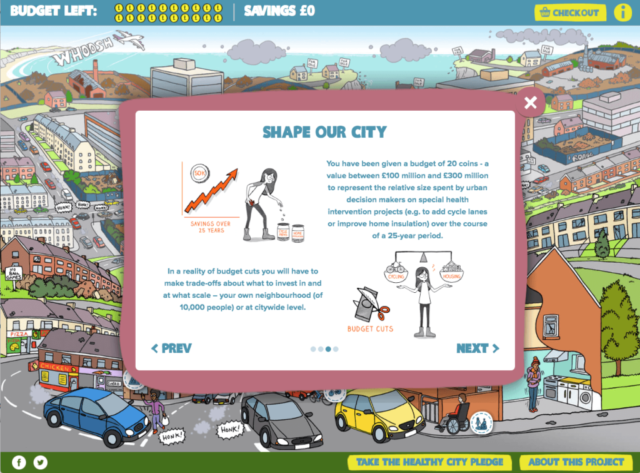
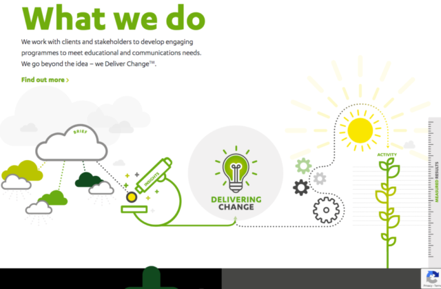
Illustration on websites has been something available to those who have an in house graphic illustrator or those willing to outsource it but it is becoming more and more available to us all. There are now online design tools that make this side of design much more accessible. It is great to see art being showcased digitally, companies are able to represent talented artists on an online platform and the benefit for those artists is huge. Big software brands such as Slack, Air bnb, Mailchimp, Dropbox have all used illustrations from different artists to enhance the experience of the user.
4. Motion & animation
As the digital world grows and the competition heats up, the less patience the user has when searching the web. They’ll leave your website if it takes too long to load, or if they can’t find what their looking for easily or within a few seconds therefore designers have to work harder. An easy way to portray information quickly and in an interactive, exciting way is by adding motion or animation to images, text, and banners. Things like gifs have become a great way to transfer complex ideas very quickly, they also load a lot more quickly than videos. Just be careful to not over do it – as with many things, less is more!
5. Bold, simple, oversized typography
This trend has grown throughout 2019 as we’ve seen a complete ‘helveticisation of brand identity,’ where companies have stripped back their entire design style. Instead of playing with fancy fonts and colours, designers are using titles with letters in large point sizes and sans, slab and serif typography.
6. Accessibility
Not really a design trend but one to watch out for in 2020 is your website’s accessibility. When designing the website you should think about colour contrasts, size of fonts and keyboard navigation. Google will rank websites higher if they comply with accessibility requirements. In turn, if a website is more accessible it will often have considered the user’s experience and journey and will therefore perform much better as well. A win-win!
We work hard to ensure our websites are kept up to date and relevant. We’re always keen to discuss new trends and create beautiful, practical and well designed websites. If you’re interested in updating your current website or would like some advice, send us a message or give as call on 0117 230 3322.

