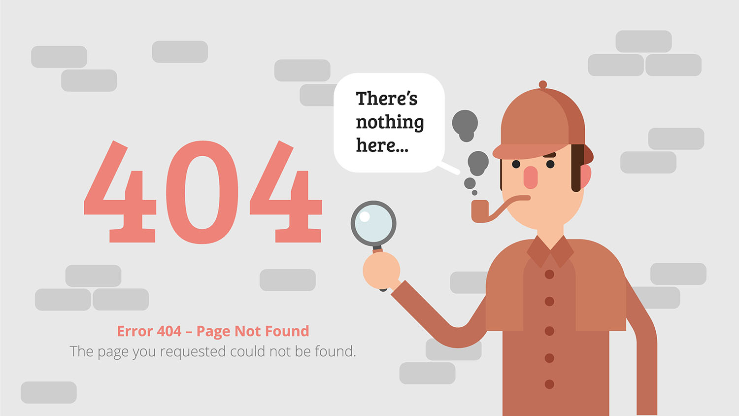
Uh-Oh that page does not exist! We’ve all had that slightly painful feeling of landing on a 404 error page, a page that the website will take you to when you’ve clicked on a broken link, or mistyped a URL. Traditionally it has been a source of frustration but a handful of sites have started a new trend: to make an opportunity of this mishap, a chance to add some humour, show a bit of character and to generally brighten up the dull pain of landing on a 404 page.
Changes happen to every site; products get removed, content gets edited, or there are changes in the structure. Broken links are an unfortunate fact of life, there is no escaping them. But there are ways of making the most of them.
Here are a few of our favourites:
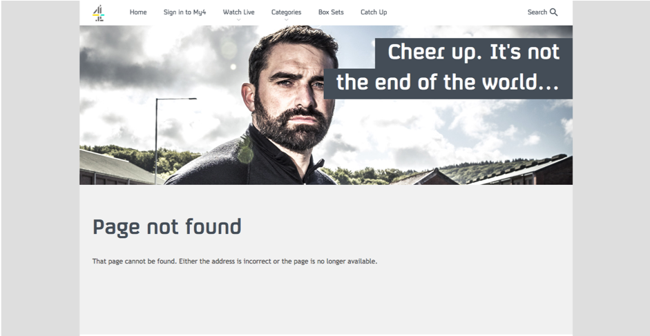
Things to think about:
Stay On-Brand
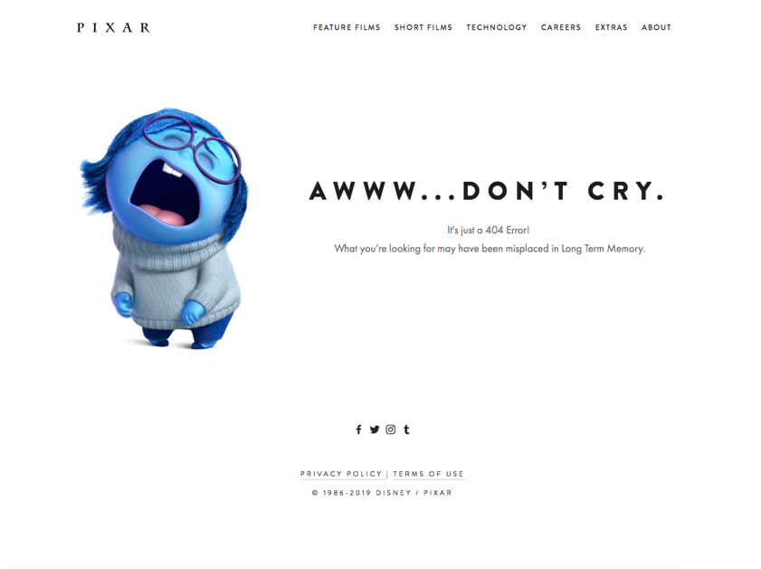
Retain the attention of your user by playing up to the reason they visited your site in the first place- they want you, your brand and your products or services, you may even increase your conversions!
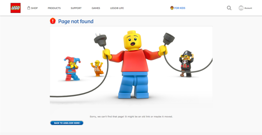
Make them Laugh
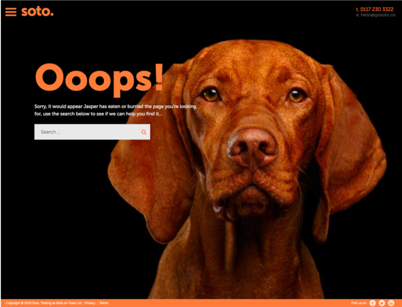
We might have had something to do with this one!
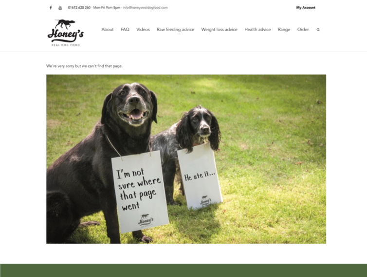
Keep it Simple
Replace the techy language and the default 404 message with phrases people will understand. For example, “Page not found,” “Sorry we can’t find the page you were looking for,” “Oops! Something is broken.”
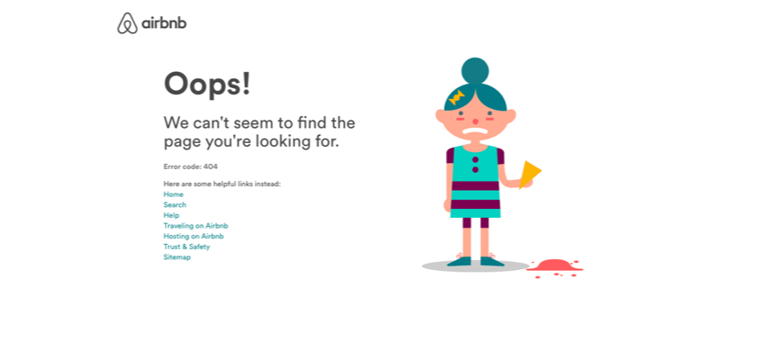
Make it Fun
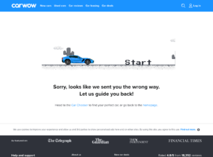
Add something interactive for your users to have a play with, it will grab their attention and encourage them to stay on your site longer. Plus it might put a smile on their face! We think you’ll really like this one:
Need ideas for your 404 page? Get in touch ?

