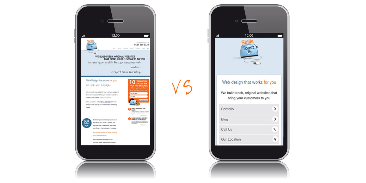
More and more business owners, in Bristol (the UK, the world!) are taking the decision to go mobile, but what does that really mean and why are they doing it?
For years, web designers have been honing their craft to make websites as succinct and digestible as possible, but when it comes to viewing a site on your mobile, most sites just don’t cut it. “But why?”, I hear you cry!
Improved usability
Well, firstly, there is a lot less screen space to play with on a mobile phone. Yes, users can usually zoom in to get a better look, but that doesn’t make a particularly user friendly experience. You’ve probably tried this yourself and know exactly what I mean. A more concise mobile version of your website will keep mobile users there for longer.
Google loves mobile
It has been widely reported by SEO experts, the ones at SoT included, that Google really appreciates you serving a different version of your website up to mobile users. They have spoken openly on their webmasters blog about improving websites so that mobile users “experience the full richness of the web” and have stated that “We plan to roll out several ranking changes in the near future that address sites that are misconfigured for smartphone users.”
Mobile web usage is on the up
Statistics on mobile internet usage vs traditional/desktop usage vary wildly. This month, web magazine Mashable published statistics from StatCounter that suggest that 17% of global web usage comes from mobile phones.

Whatever the real figures, there is no doubt that mobile usage is on the up and some predict that it will overtake desktop usage in as little as 5 years.
So what makes a great mobile site?
Here are our top 5 tips on what makes a great mobile website.
- Use simple navigation – People using mobile devices are often on the go; on the train, the bus, walking down the street. If they can’t navigate your site because they keep missing the tiny links on their mobile screen, they’re likely to go elsewhere. Use large clickable buttons that take the user to the most essential information.
- Make it snappy – Mobile sites are designed to load quickly for people using 3G and 4G networks and open much more quickly than most desktop sites.
- Keep it brief – Don’t use reams of text on your mobile site; people are very unlikely to read it. Use fewer words and smaller graphics to get straight to the point because mobile users are very unlikely to wade through a lot of text.
- Use ‘click to call’ – With a mobile website you can add a link that when clicked calls the website owner – a really great way to speak to new customers.
- Pinpoint your location – Most mobile users have a GPS functionality on their phone – take advantage of that by displaying your location and helping them to find you.


